
People with disabilities such as color blindness may have difficulties reading and understanding their emails. If you have a colleague, client, friend, or family member who suffers from certain conditions, Outlook offers the accessibility feature to ensure creating and sending emails that are as accessible as possible. Moreover, there are several tips that can make a difference, and you may want to consider them when creating a message in Microsoft Outlook. What makes the accessibility tool particularly handy is that it not only shows you what might be an issue but also gives you detailed instructions on why and how you should make the adjustments.
Lookeen makes your desktop and email search as simple and fast as possible!
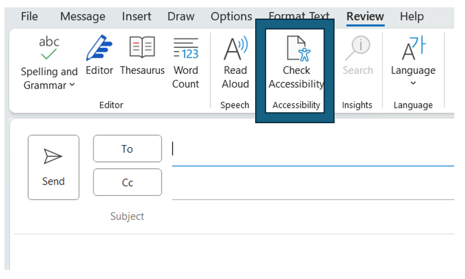
How to Use the Accessibility Checker in Outlook (Windows)
Step 1: When writing or composing an email, click on the “Review” tab.
Step 2: Now, select “Check Accessibility” at the top left. The “Accessibility Pane” will open on the right, and you can review and address the findings.
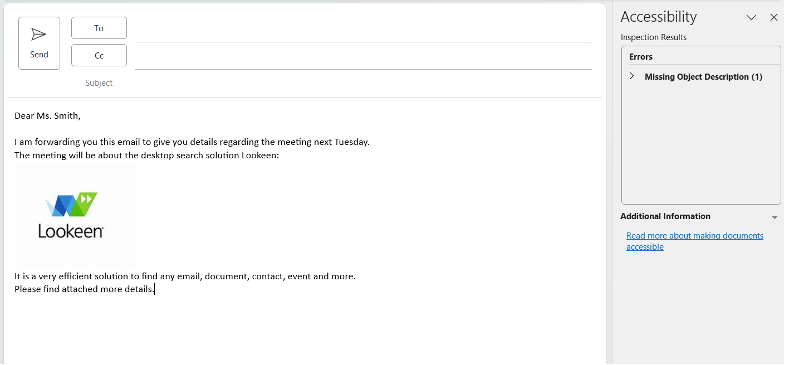
Step 3: To review findings, select an issue under “Warning and Errors.” As a result, a list will expand indicating objects and items affected.
Step 4: To address findings, click the down arrow button next to the issue you want to focus on to open the “Recommended Actions” list.
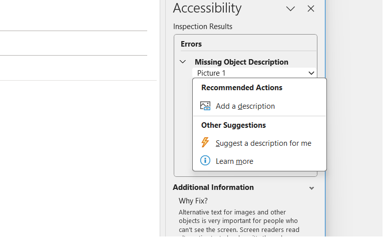
Step 5: You can now select an action from the drop-down menu or click the right arrow button next to an action to see more options.
How to keep the Accessibility Checker Running
If you have to send messages suitable for people with disabilities, you might want to keep the accessibility checker running. At the sidebar, you will find the option “Keep accessibility checker running while I work.” Simply check the box there.
With Lookeen any email, contact, or document will be accessible in seconds!
Quick Tips for Better Accessibility
Rule number one: keep it as simple as possible! Make sure to keep the message as structured and understandable as possible. Therefore, using headlines and bullet points can be very useful. In case your email, however, requires, for example, links and pictures, the following tips can help make messages more suitable for people with disabilities.
Pictures: Enter an Alt text to your picture providing a description. To do so, right-click the picture, choose “Edit Alt Text” from the drop-down menu, and enter a short text communicating the picture’s purpose.
Links: Link test should be descriptive and well structured, avoid using short terms such as simply writing “Click here.”
Color Contrast: Your message should be readable in High Contrast mode. Use high-contrast color schemes or bright colors. Black-and-white schemes make it easier for colorblind people to distinguish shapes and text.
Do you have any recommendations for ensuring accessibility for people with disabilities?
Feel free to share in the comment section.
See you soon,
Aline & the Lookeen team


Comments